Light
Dark
Brand Strategy
Design
Startups
What Investors Actually Notice About Your Website
The impression of your brand forms in 2.6 seconds. Your website is not just a sales tool. It’s a credibility checkpoint.

Introduction
Your website is often an investor’s strongest impression of your business—the one that leaves a lasting taste in their mouth. Seasoned investors can glean 80% of what they need to know within the first 30 seconds of landing on your homepage. And the rest? It’s either noise—or worse, red flags that scream “amateur hour.”
Across interviews, pitch reviews, and countless teardown conversations, a pattern emerges: promising companies lose investor interest before a pitch even begins. Not because the idea is weak. But because your brand’s presence fails to answer the one question that matters most:
“Why should I believe these guys will win?”
This is again about trust. This is the investor’s litmus test. Every visual, every line of copy, every claim you make on your homepage needs to have a confident, reverse-engineered, evidence-backed answer to it. Not tomorrow. Not after your developer “gets to it.” Now!
The Brutal Economics of Attention
A study by the Missouri University of Science and Technology found that users form an impression of your brand within 2.6 seconds of seeing your website’s homepage.
2.6 seconds! That’s faster than you can say “Please invest in our shiny SaaS.”
While this was focused on general web behavior, it absolutely applies to investors—people looking at hundreds of pitch decks and websites every month, most of which blend together like beige paint on a beige wall.
They’re trained to spot signal through the noise. If your website isn’t giving them signal fast, it’s actively working against you. You’re just another forgettable tab on their RAM-starved, thin AF laptops that they’ll close without a second thought.
“Simplicity is helpful and shows a clarity of vision and the ability to sell.” — Karin Klein, Bloomberg Beta
If your site doesn’t create immediate clarity and trust, it’s over before it starts. No second chances. No appeals process. Just the silent back-click of opportunity walking out the door, probably toward your competitor who actually invested in their brand presence.
The Narrative-Design Connection
1. Brand Storytelling Through Visual Identity
Successful startup websites don’t just state what they do—they wrap their solution in a compelling narrative through both words and visual design. The mediocre ones slap together some buzzwords and call it a day.
“The startups that capture my attention create a unified story across every element of their website,” explains Kirsten Green of Forerunner Ventures. “Their visual identity reinforces their mission in a way that feels authentic and purposeful.”
This narrative-design connection isn’t some fluffy nice-to-have your ”business guy” founder can dismiss. It’s the difference between being remembered and being forgotten. It shows up as:
Color psychology that reinforces brand values (not just whatever template color your Fiverr developer couldn’t be bothered to change)
Typography that reflects brand personality (authoritative, innovative, friendly—pick a lane)
Visual metaphors that make complex solutions more intuitive
Consistent design language that builds recognition and trust
Research from NN/G shows that visual consistency significantly increases brand recognition—a crucial factor when investors are comparing dozens of companies in your space. And trust us, they are comparing you. Brutally.
2. Information Architecture as Strategic Storytelling
How you structure information on your website reveals your strategic thinking. Users are 37% more likely to connect deeply with content when information is architected in an intuitive, narrative flow.
“When I visit a startup’s website, I’m evaluating their ability to communicate complex ideas clearly,” notes Sarah Tavel of Benchmark. “How they structure their website often mirrors how they think about their business.”
Think about that. Your website’s information architecture is silently telling investors whether you can think clearly or not. That mess of randomly ordered menu items? It’s screaming “our strategy changes with the wind.”
3. Visual Hierarchy That Guides Investor Focus
Strategic design doesn’t treat all information equally. It creates visual hierarchies that guide the reader’s eye to what matters most. Amateur design treats everything as equally important—which means nothing is important.
“The best founder websites make it effortless for me to understand their core value proposition,” explains Fred Wilson of Union Square Ventures. “Design should guide me to the most important information first, then allow me to dig deeper if I’m interested.”
Effective visual hierarchy isn’t accidental. It’s engineered through:
Contrast and scale to emphasize key messages
Strategic white space to create focal points
Color and typography variations to signal importance
Position and placement considerations (the F-pattern and Z-pattern of eye movement)
Your website’s visual hierarchy is either working for you or against you. There’s no neutral ground here.
What Investors Actually Notice (And Why Design Matters)
1. Narrative Clarity
This is non-negotiable. Can they understand, in one glance:
What specific problem do you solve?
Who exactly are you solving it for?
How is your approach different or better than existing solutions?
Here’s an example cliché from an endless ocean of definitional drivel:
“Empowering the next generation of digital transformation.”
What the hell does that even mean? And don’t even get us started on all the startups who claim they’re “helping grow revenue“ and “driving ROI.”
Congratulations on blending perfectly into the beige wall of forgettable narratives. You might as well have written “We do stuff for people who need stuff done.” At least that’d be honest.
2. Design That Signals Discipline
While investors aren’t design critics, they do—just like all of us, whether we know it or not—make quick judgments about your company based on visual presentation. Studies have found that 75% of users judge a company's credibility based on its website design (Sweor, ColorWhistle, RGC Digital Marketing).
For investors, it’s not just about taste—it’s about trust. And trust is earned, not given.
“The smallest company in the world can look as large as the largest company on the web.” — Steve Jobs
What They Notice:
Professional, cohesive brand identity
Clean, modern design that feels current
Absence of obvious template elements or stock photos (yes, we can all tell)
Mobile responsiveness
What Great Design Signals:
You’re detail-oriented
You can execute with care
You understand how perception influences buying—and therefore, funding
What Bad Design Signals:
You’re not serious
You’re under-resourced
You lack taste or discipline
You’ll cut corners elsewhere too
Design isn’t a cherry on top—it’s a credibility layer. For early-stage startups, design is traction. It’s the silent proof you have what it takes to execute. Especially before you have any real metrics to show.
“Your website is a proxy for how thoughtful you are about user experience. If you can’t create a clear, compelling website, investors may question your ability to create a clear, compelling product.” — Elizabeth Yin of Hustle Fund
When investors ask, “Why should I believe these guys will win?”—great design is part of the answer.
3. User Experience as a Proxy for Product Thinking
For investors, your website experience serves as a tangible demonstration of how you approach product development. According to research from McKinsey & Company, companies with strong design outperform industry-benchmark growth by as much as two-to-one.
“How founders design their website experience often reveals how they think about product experience,” explains Elizabeth Yin of Hustle Fund. “If your website is confusing or frustrating, it raises questions about your product design sensibilities.”
That slow loading animation you thought was cool? It’s raising silent red flags about your technical priorities. That buried contact page? It’s making them wonder if your product will be just as unintuitive. Those typos? They’re wondering what else you missed.
4. Visual Storytelling of Your Value Proposition
The most compelling startup websites use visual storytelling techniques to make complex value propositions immediately understandable.
You don’t have time for investors to read four paragraphs explaining what you do. Show them. Or watch them bounce faster than a kid on a sugar high.
Effective visual storytelling includes:
Before/after demonstrations
Process visualizations
Data visualization and infographics
Product screenshots in context
Customer journey illustrations
Your competitor is figuring this out while you’re still debating whether design really matters. Spoiler alert: they’re winning.
5. Social Proof Integration
How you visually integrate social proof signals can dramatically influence investor perception. NN/g research suggests that the presentation of social proof is often more important than the proof itself.
It’s not just who endorsed you—it’s how you showcase that endorsement:
Testimonial design that highlights the human element
Logo showcases with visual hierarchy based on recognition (no, your cousin’s startup doesn’t count)
Case study presentation that balances story and results
Press mention integration that feels earned, not desperate
Awards and recognition displays that build credibility
The gap between “we have social proof” and “our social proof is compelling” is the difference between getting a polite pass and getting a meeting.
The Design-Narrative Matrix: A Framework for Investor Websites
Based on research and investor feedback, we’ve developed a framework for evaluating how effectively your website balances design and narrative:
Quadrant 1: High Design + Strong Narrative = Magnetic
Characteristics: Cohesive visual identity, intuitive information architecture, strategic visual hierarchy, meaningful interactions
Investor Response: “I understand what they do, why it matters, and I’m impressed by how they think about user experience.“
Examples: Stripe, Notion, Brex
Your job: Get here or die trying
Quadrant 2: High Design + Weak Narrative = Confusing
Characteristics: Beautiful visuals but unclear value proposition, generic messaging, lack of specific differentiation
Investor Response: “It looks impressive, but I don’t understand what problem they’re solving or why they’ll win.”
Examples: Many failed consumer apps with style but no substance
Your job: Stop hiding behind pretty pictures and say something meaningful
Quadrant 3: Low Design + Strong Narrative = Promising but Underperforming
Characteristics: Clear messaging but poor visual execution, inconsistent brand identity, distracting or dated design elements
Investor Response: “The idea seems solid, but I question their execution ability based on their website’s experience.”
Examples: Early-stage technical startups with strong products but weak brand presence
Your job: Your words deserve better design. Get help.
Quadrant 4: Low Design + Weak Narrative = Non-Starter
Characteristics: Generic templates, unclear messaging, poor information hierarchy, lack of brand identity
Investor Response: “Next...”
Examples: The majority of failed startups
Your job: Start over. Completely.
Case Studies: Design That Drives Investment
Notion: Simplicity as Sophistication
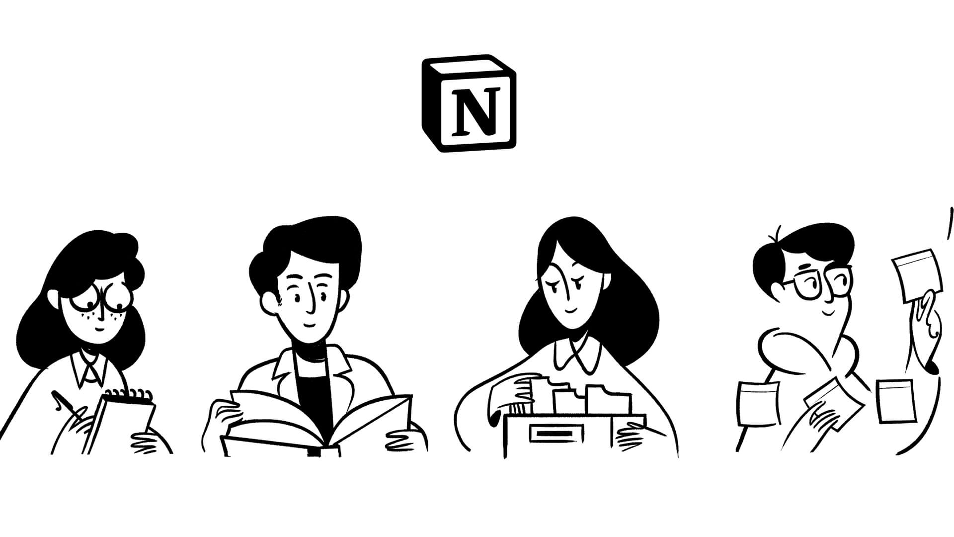
When Notion was raising their Series A, their website demonstrated how powerful minimalist design can be when paired with clear messaging.
Ivan Zhao, Notion’s co-founder, explains: “We deliberately kept our website simple and focused on the problem we were solving. Investors could understand our vision in seconds.”
What worked:
Clean, distinctive typography system that reflected their product design
Strategic white space that focused attention on key messages
Interactive demonstrations that showed rather than told
Unified design language between marketing site and product
Progressive disclosure of features through intuitive information architecture
They weren‘t “too busy building product” to care about design. They understood—Design IS Product.
Airbnb: Emotional Design That Builds Connection
Before becoming a household name, Airbnb’s early website design created emotional connection through strategic storytelling and visual design.
What worked:
Photography strategy that highlighted real spaces and experiences
Information architecture that prioritized trust and safety concerns
Brand identity that balanced aspiration with accessibility
User experience patterns that made complex processes feel simple
Mobile-first thinking that recognized changing user behaviors
They didn’t just “put heads in beds”. They sold a feeling, visually, and viscerally. And it worked to the tune of billions.
Strategic Design: A Competitive Advantage
The fundraising landscape is fast and unforgiving. And strategic design is increasingly a differentiator. According to McKinsey’s Design Index, companies with strong design outperform their industry counterparts by 200% in revenue growth.
“The bar for design quality has risen dramatically,” notes Fred Wilson. “Five years ago, a functional website was sufficient. Today, your website needs to demonstrate sophisticated thinking about user experience and brand storytelling.”
You‘re not competing against “good enough.” You‘re competing against the best version of what your investors have already seen—and subconsciously expect. And they’ve seen some damn good websites.
Optimizing Your Website for Impact
Based on both research and investor feedback, here are the most effective strategies for creating a website that resonates with investors:
1. Establish Visual-Verbal Alignment
Ensure your visual design reinforces your core messaging instead of competing with it. Visual-verbal alignment increases message retention by up to 65%.
Test your visual-verbal alignment by asking: Could someone understand your value proposition from visual elements alone? Do your visuals contradict or reinforce your messaging?
If your copy says “enterprise-grade security” but your design looks like a Fisher-Price toy—yeah, good luck selling that unicorn dream.
2. Design for Cognitive Ease
Cognitive Ease—the measure of how easily our brains process information—significantly impacts investor perception. Information presented with greater cognitive ease is perceived as more trustworthy and valuable.
Design elements that increase cognitive ease:
Clear typography hierarchies that guide reading
Strategic use of white space to reduce visual noise
Consistent patterns and visual language
Information chunking that respects working memory limitations
Color and contrast that enhances readability
Make them work too hard to understand you, and they’ll simply...stop trying. Do you think they have the time? Even you don’t have the time.
3. Create a Memorable Visual Identity
Distinctive visual identity helps you stand out. Ignore, and join the faceless masses of forgettable startups that all “wanted to be something.”
Elements of memorable visual identity:
Distinctive color palette that differentiates from competitors
Custom typography or thoughtful type pairing
Consistent visual metaphors and imagery style
Signature interactive elements that feel uniquely yours
Design system consistency across all touch-points
When they can‘t remember if it was your startup or the other one they saw yesterday that does the same thing, you‘ve already lost.
4. Elevate Your Social Proof Presentation
How you present social proof is as important as the proof itself. The design presentation of social proof significantly impacts its credibility.
Design strategies for credible social proof:
Contextual presentation rather than generic testimonial sliders
Visual hierarchy that prioritizes recognizable brands or figures
Integration of social proof within the narrative flow, not isolated
Design that emphasizes human elements in testimonials
Specific results and outcomes highlighted through data visualization
That wall of logos you’re so proud of? Everyone has them. At this point, they’re just banner-blindness fodder. So what’s gonna make yours stand out? Talk to us. We know how.
5. Optimize for Mobile-First Impressions
With investors increasingly reviewing startups on mobile devices, mobile-optimized design is essential.
Mobile design priorities:
Critical content appearing before the scroll on mobile
Touch targets sized appropriately (minimum 44x44 pixels)
Typography scaled for mobile readability (minimum 16px font size)
Performance optimization for varying network conditions
Simplified navigation optimized for thumb zones
That VP of Investments is looking at your site from their phone while walking between meetings. Make it work. Or don’t. Your choice.
The Truth: Where Substance and Design Converge
After analyzing numerous investor interviews and fundraising outcomes, we’ve discovered something crucial: the most successful fundraising websites achieve a powerful synergy between substance and design.
“Great design isn’t just about aesthetics—it’s about communication,” explains Fred Wilson of Union Square Ventures. “When substance and design work together, your message becomes exponentially more powerful.”
Strategic design elevates your core message by:
Creating visual hierarchies that guide investors to your most compelling points
Building credibility through thoughtful, professional execution
Demonstrating your attention to detail and user experience
Reflecting your company’s values and culture visually
The most effective investor websites use intentional design to answer these fundamental questions with clarity and impact:
What problem are you solving?
For whom are you solving it?
Why is your solution better than alternatives?
Why is your team the right one to execute on this vision?
What evidence do you have that it’s working?
When substance and design work in harmony, you create more than just an impressive website—you create a powerful tool that transforms investor perception and opens doors to meaningful conversations.
Your website is not just a sales tool. It’s a credibility checkpoint. It’s a live demonstration of your capabilities. Build it like your first pitch, because for many investors—it is.
Build to Impress. Scale to Win.
If you’re serious about making your website a strategic asset and not just a placeholder—let’s talk.
SHARE THIS
Related Articles

Creative Industry
Culture & Tech
Future of Work
The Great Blanding
1 May 2026

Creative Industry
Culture & Tech
Future of Work
Human Craft Is Worth More Than Ever: What Survives the Blanding
1 May 2026

Creative Industry
Culture & Tech
Future of Work
The Grift Class and the Economy of Anxiety
28 Apr 2026
Brand Strategy
Design
Startups
What Investors Actually Notice About Your Website
The impression of your brand forms in 2.6 seconds. Your website is not just a sales tool. It’s a credibility checkpoint.
Introduction
Your website is often an investor’s strongest impression of your business—the one that leaves a lasting taste in their mouth. Seasoned investors can glean 80% of what they need to know within the first 30 seconds of landing on your homepage. And the rest? It’s either noise—or worse, red flags that scream “amateur hour.”
Across interviews, pitch reviews, and countless teardown conversations, a pattern emerges: promising companies lose investor interest before a pitch even begins. Not because the idea is weak. But because your brand’s presence fails to answer the one question that matters most:
“Why should I believe these guys will win?”
This is again about trust. This is the investor’s litmus test. Every visual, every line of copy, every claim you make on your homepage needs to have a confident, reverse-engineered, evidence-backed answer to it. Not tomorrow. Not after your developer “gets to it.” Now!
The Brutal Economics of Attention
A study by the Missouri University of Science and Technology found that users form an impression of your brand within 2.6 seconds of seeing your website’s homepage.
2.6 seconds! That’s faster than you can say “Please invest in our shiny SaaS.”
While this was focused on general web behavior, it absolutely applies to investors—people looking at hundreds of pitch decks and websites every month, most of which blend together like beige paint on a beige wall.
They’re trained to spot signal through the noise. If your website isn’t giving them signal fast, it’s actively working against you. You’re just another forgettable tab on their RAM-starved, thin AF laptops that they’ll close without a second thought.
“Simplicity is helpful and shows a clarity of vision and the ability to sell.” — Karin Klein, Bloomberg Beta
If your site doesn’t create immediate clarity and trust, it’s over before it starts. No second chances. No appeals process. Just the silent back-click of opportunity walking out the door, probably toward your competitor who actually invested in their brand presence.
The Narrative-Design Connection
1. Brand Storytelling Through Visual Identity
Successful startup websites don’t just state what they do—they wrap their solution in a compelling narrative through both words and visual design. The mediocre ones slap together some buzzwords and call it a day.
“The startups that capture my attention create a unified story across every element of their website,” explains Kirsten Green of Forerunner Ventures. “Their visual identity reinforces their mission in a way that feels authentic and purposeful.”
This narrative-design connection isn’t some fluffy nice-to-have your ”business guy” founder can dismiss. It’s the difference between being remembered and being forgotten. It shows up as:
Color psychology that reinforces brand values (not just whatever template color your Fiverr developer couldn’t be bothered to change)
Typography that reflects brand personality (authoritative, innovative, friendly—pick a lane)
Visual metaphors that make complex solutions more intuitive
Consistent design language that builds recognition and trust
Research from NN/G shows that visual consistency significantly increases brand recognition—a crucial factor when investors are comparing dozens of companies in your space. And trust us, they are comparing you. Brutally.
2. Information Architecture as Strategic Storytelling
How you structure information on your website reveals your strategic thinking. Users are 37% more likely to connect deeply with content when information is architected in an intuitive, narrative flow.
“When I visit a startup’s website, I’m evaluating their ability to communicate complex ideas clearly,” notes Sarah Tavel of Benchmark. “How they structure their website often mirrors how they think about their business.”
Think about that. Your website’s information architecture is silently telling investors whether you can think clearly or not. That mess of randomly ordered menu items? It’s screaming “our strategy changes with the wind.”
3. Visual Hierarchy That Guides Investor Focus
Strategic design doesn’t treat all information equally. It creates visual hierarchies that guide the reader’s eye to what matters most. Amateur design treats everything as equally important—which means nothing is important.
“The best founder websites make it effortless for me to understand their core value proposition,” explains Fred Wilson of Union Square Ventures. “Design should guide me to the most important information first, then allow me to dig deeper if I’m interested.”
Effective visual hierarchy isn’t accidental. It’s engineered through:
Contrast and scale to emphasize key messages
Strategic white space to create focal points
Color and typography variations to signal importance
Position and placement considerations (the F-pattern and Z-pattern of eye movement)
Your website’s visual hierarchy is either working for you or against you. There’s no neutral ground here.
What Investors Actually Notice (And Why Design Matters)
1. Narrative Clarity
This is non-negotiable. Can they understand, in one glance:
What specific problem do you solve?
Who exactly are you solving it for?
How is your approach different or better than existing solutions?
Here’s an example cliché from an endless ocean of definitional drivel:
“Empowering the next generation of digital transformation.”
What the hell does that even mean? And don’t even get us started on all the startups who claim they’re “helping grow revenue“ and “driving ROI.”
Congratulations on blending perfectly into the beige wall of forgettable narratives. You might as well have written “We do stuff for people who need stuff done.” At least that’d be honest.
2. Design That Signals Discipline
While investors aren’t design critics, they do—just like all of us, whether we know it or not—make quick judgments about your company based on visual presentation. Studies have found that 75% of users judge a company's credibility based on its website design (Sweor, ColorWhistle, RGC Digital Marketing).
For investors, it’s not just about taste—it’s about trust. And trust is earned, not given.
“The smallest company in the world can look as large as the largest company on the web.” — Steve Jobs
What They Notice:
Professional, cohesive brand identity
Clean, modern design that feels current
Absence of obvious template elements or stock photos (yes, we can all tell)
Mobile responsiveness
What Great Design Signals:
You’re detail-oriented
You can execute with care
You understand how perception influences buying—and therefore, funding
What Bad Design Signals:
You’re not serious
You’re under-resourced
You lack taste or discipline
You’ll cut corners elsewhere too
Design isn’t a cherry on top—it’s a credibility layer. For early-stage startups, design is traction. It’s the silent proof you have what it takes to execute. Especially before you have any real metrics to show.
“Your website is a proxy for how thoughtful you are about user experience. If you can’t create a clear, compelling website, investors may question your ability to create a clear, compelling product.” — Elizabeth Yin of Hustle Fund
When investors ask, “Why should I believe these guys will win?”—great design is part of the answer.
3. User Experience as a Proxy for Product Thinking
For investors, your website experience serves as a tangible demonstration of how you approach product development. According to research from McKinsey & Company, companies with strong design outperform industry-benchmark growth by as much as two-to-one.
“How founders design their website experience often reveals how they think about product experience,” explains Elizabeth Yin of Hustle Fund. “If your website is confusing or frustrating, it raises questions about your product design sensibilities.”
That slow loading animation you thought was cool? It’s raising silent red flags about your technical priorities. That buried contact page? It’s making them wonder if your product will be just as unintuitive. Those typos? They’re wondering what else you missed.
4. Visual Storytelling of Your Value Proposition
The most compelling startup websites use visual storytelling techniques to make complex value propositions immediately understandable.
You don’t have time for investors to read four paragraphs explaining what you do. Show them. Or watch them bounce faster than a kid on a sugar high.
Effective visual storytelling includes:
Before/after demonstrations
Process visualizations
Data visualization and infographics
Product screenshots in context
Customer journey illustrations
Your competitor is figuring this out while you’re still debating whether design really matters. Spoiler alert: they’re winning.
5. Social Proof Integration
How you visually integrate social proof signals can dramatically influence investor perception. NN/g research suggests that the presentation of social proof is often more important than the proof itself.
It’s not just who endorsed you—it’s how you showcase that endorsement:
Testimonial design that highlights the human element
Logo showcases with visual hierarchy based on recognition (no, your cousin’s startup doesn’t count)
Case study presentation that balances story and results
Press mention integration that feels earned, not desperate
Awards and recognition displays that build credibility
The gap between “we have social proof” and “our social proof is compelling” is the difference between getting a polite pass and getting a meeting.
The Design-Narrative Matrix: A Framework for Investor Websites
Based on research and investor feedback, we’ve developed a framework for evaluating how effectively your website balances design and narrative:
Quadrant 1: High Design + Strong Narrative = Magnetic
Characteristics: Cohesive visual identity, intuitive information architecture, strategic visual hierarchy, meaningful interactions
Investor Response: “I understand what they do, why it matters, and I’m impressed by how they think about user experience.“
Examples: Stripe, Notion, Brex
Your job: Get here or die trying
Quadrant 2: High Design + Weak Narrative = Confusing
Characteristics: Beautiful visuals but unclear value proposition, generic messaging, lack of specific differentiation
Investor Response: “It looks impressive, but I don’t understand what problem they’re solving or why they’ll win.”
Examples: Many failed consumer apps with style but no substance
Your job: Stop hiding behind pretty pictures and say something meaningful
Quadrant 3: Low Design + Strong Narrative = Promising but Underperforming
Characteristics: Clear messaging but poor visual execution, inconsistent brand identity, distracting or dated design elements
Investor Response: “The idea seems solid, but I question their execution ability based on their website’s experience.”
Examples: Early-stage technical startups with strong products but weak brand presence
Your job: Your words deserve better design. Get help.
Quadrant 4: Low Design + Weak Narrative = Non-Starter
Characteristics: Generic templates, unclear messaging, poor information hierarchy, lack of brand identity
Investor Response: “Next...”
Examples: The majority of failed startups
Your job: Start over. Completely.
Case Studies: Design That Drives Investment
Notion: Simplicity as Sophistication
When Notion was raising their Series A, their website demonstrated how powerful minimalist design can be when paired with clear messaging.
Ivan Zhao, Notion’s co-founder, explains: “We deliberately kept our website simple and focused on the problem we were solving. Investors could understand our vision in seconds.”
What worked:
Clean, distinctive typography system that reflected their product design
Strategic white space that focused attention on key messages
Interactive demonstrations that showed rather than told
Unified design language between marketing site and product
Progressive disclosure of features through intuitive information architecture
They weren‘t “too busy building product” to care about design. They understood—Design IS Product.
Airbnb: Emotional Design That Builds Connection
Before becoming a household name, Airbnb’s early website design created emotional connection through strategic storytelling and visual design.
What worked:
Photography strategy that highlighted real spaces and experiences
Information architecture that prioritized trust and safety concerns
Brand identity that balanced aspiration with accessibility
User experience patterns that made complex processes feel simple
Mobile-first thinking that recognized changing user behaviors
They didn’t just “put heads in beds”. They sold a feeling, visually, and viscerally. And it worked to the tune of billions.
Strategic Design: A Competitive Advantage
The fundraising landscape is fast and unforgiving. And strategic design is increasingly a differentiator. According to McKinsey’s Design Index, companies with strong design outperform their industry counterparts by 200% in revenue growth.
“The bar for design quality has risen dramatically,” notes Fred Wilson. “Five years ago, a functional website was sufficient. Today, your website needs to demonstrate sophisticated thinking about user experience and brand storytelling.”
You‘re not competing against “good enough.” You‘re competing against the best version of what your investors have already seen—and subconsciously expect. And they’ve seen some damn good websites.
Optimizing Your Website for Impact
Based on both research and investor feedback, here are the most effective strategies for creating a website that resonates with investors:
1. Establish Visual-Verbal Alignment
Ensure your visual design reinforces your core messaging instead of competing with it. Visual-verbal alignment increases message retention by up to 65%.
Test your visual-verbal alignment by asking: Could someone understand your value proposition from visual elements alone? Do your visuals contradict or reinforce your messaging?
If your copy says “enterprise-grade security” but your design looks like a Fisher-Price toy—yeah, good luck selling that unicorn dream.
2. Design for Cognitive Ease
Cognitive Ease—the measure of how easily our brains process information—significantly impacts investor perception. Information presented with greater cognitive ease is perceived as more trustworthy and valuable.
Design elements that increase cognitive ease:
Clear typography hierarchies that guide reading
Strategic use of white space to reduce visual noise
Consistent patterns and visual language
Information chunking that respects working memory limitations
Color and contrast that enhances readability
Make them work too hard to understand you, and they’ll simply...stop trying. Do you think they have the time? Even you don’t have the time.
3. Create a Memorable Visual Identity
Distinctive visual identity helps you stand out. Ignore, and join the faceless masses of forgettable startups that all “wanted to be something.”
Elements of memorable visual identity:
Distinctive color palette that differentiates from competitors
Custom typography or thoughtful type pairing
Consistent visual metaphors and imagery style
Signature interactive elements that feel uniquely yours
Design system consistency across all touch-points
When they can‘t remember if it was your startup or the other one they saw yesterday that does the same thing, you‘ve already lost.
4. Elevate Your Social Proof Presentation
How you present social proof is as important as the proof itself. The design presentation of social proof significantly impacts its credibility.
Design strategies for credible social proof:
Contextual presentation rather than generic testimonial sliders
Visual hierarchy that prioritizes recognizable brands or figures
Integration of social proof within the narrative flow, not isolated
Design that emphasizes human elements in testimonials
Specific results and outcomes highlighted through data visualization
That wall of logos you’re so proud of? Everyone has them. At this point, they’re just banner-blindness fodder. So what’s gonna make yours stand out? Talk to us. We know how.
5. Optimize for Mobile-First Impressions
With investors increasingly reviewing startups on mobile devices, mobile-optimized design is essential.
Mobile design priorities:
Critical content appearing before the scroll on mobile
Touch targets sized appropriately (minimum 44x44 pixels)
Typography scaled for mobile readability (minimum 16px font size)
Performance optimization for varying network conditions
Simplified navigation optimized for thumb zones
That VP of Investments is looking at your site from their phone while walking between meetings. Make it work. Or don’t. Your choice.
The Truth: Where Substance and Design Converge
After analyzing numerous investor interviews and fundraising outcomes, we’ve discovered something crucial: the most successful fundraising websites achieve a powerful synergy between substance and design.
“Great design isn’t just about aesthetics—it’s about communication,” explains Fred Wilson of Union Square Ventures. “When substance and design work together, your message becomes exponentially more powerful.”
Strategic design elevates your core message by:
Creating visual hierarchies that guide investors to your most compelling points
Building credibility through thoughtful, professional execution
Demonstrating your attention to detail and user experience
Reflecting your company’s values and culture visually
The most effective investor websites use intentional design to answer these fundamental questions with clarity and impact:
What problem are you solving?
For whom are you solving it?
Why is your solution better than alternatives?
Why is your team the right one to execute on this vision?
What evidence do you have that it’s working?
When substance and design work in harmony, you create more than just an impressive website—you create a powerful tool that transforms investor perception and opens doors to meaningful conversations.
Your website is not just a sales tool. It’s a credibility checkpoint. It’s a live demonstration of your capabilities. Build it like your first pitch, because for many investors—it is.
Build to Impress. Scale to Win.
If you’re serious about making your website a strategic asset and not just a placeholder—let’s talk.
SHARE THIS
Related Articles
Creative Industry
Culture & Tech
Future of Work
The Great Blanding
1 May 2026
Creative Industry
Culture & Tech
Future of Work
Human Craft Is Worth More Than Ever: What Survives the Blanding
1 May 2026
Creative Industry
Culture & Tech
Future of Work
The Grift Class and the Economy of Anxiety
28 Apr 2026
Brand Strategy
Design
Startups
What Investors Actually Notice About Your Website
The impression of your brand forms in 2.6 seconds. Your website is not just a sales tool. It’s a credibility checkpoint.
Introduction
Your website is often an investor’s strongest impression of your business—the one that leaves a lasting taste in their mouth. Seasoned investors can glean 80% of what they need to know within the first 30 seconds of landing on your homepage. And the rest? It’s either noise—or worse, red flags that scream “amateur hour.”
Across interviews, pitch reviews, and countless teardown conversations, a pattern emerges: promising companies lose investor interest before a pitch even begins. Not because the idea is weak. But because your brand’s presence fails to answer the one question that matters most:
“Why should I believe these guys will win?”
This is again about trust. This is the investor’s litmus test. Every visual, every line of copy, every claim you make on your homepage needs to have a confident, reverse-engineered, evidence-backed answer to it. Not tomorrow. Not after your developer “gets to it.” Now!
The Brutal Economics of Attention
A study by the Missouri University of Science and Technology found that users form an impression of your brand within 2.6 seconds of seeing your website’s homepage.
2.6 seconds! That’s faster than you can say “Please invest in our shiny SaaS.”
While this was focused on general web behavior, it absolutely applies to investors—people looking at hundreds of pitch decks and websites every month, most of which blend together like beige paint on a beige wall.
They’re trained to spot signal through the noise. If your website isn’t giving them signal fast, it’s actively working against you. You’re just another forgettable tab on their RAM-starved, thin AF laptops that they’ll close without a second thought.
“Simplicity is helpful and shows a clarity of vision and the ability to sell.” — Karin Klein, Bloomberg Beta
If your site doesn’t create immediate clarity and trust, it’s over before it starts. No second chances. No appeals process. Just the silent back-click of opportunity walking out the door, probably toward your competitor who actually invested in their brand presence.
The Narrative-Design Connection
1. Brand Storytelling Through Visual Identity
Successful startup websites don’t just state what they do—they wrap their solution in a compelling narrative through both words and visual design. The mediocre ones slap together some buzzwords and call it a day.
“The startups that capture my attention create a unified story across every element of their website,” explains Kirsten Green of Forerunner Ventures. “Their visual identity reinforces their mission in a way that feels authentic and purposeful.”
This narrative-design connection isn’t some fluffy nice-to-have your ”business guy” founder can dismiss. It’s the difference between being remembered and being forgotten. It shows up as:
Color psychology that reinforces brand values (not just whatever template color your Fiverr developer couldn’t be bothered to change)
Typography that reflects brand personality (authoritative, innovative, friendly—pick a lane)
Visual metaphors that make complex solutions more intuitive
Consistent design language that builds recognition and trust
Research from NN/G shows that visual consistency significantly increases brand recognition—a crucial factor when investors are comparing dozens of companies in your space. And trust us, they are comparing you. Brutally.
2. Information Architecture as Strategic Storytelling
How you structure information on your website reveals your strategic thinking. Users are 37% more likely to connect deeply with content when information is architected in an intuitive, narrative flow.
“When I visit a startup’s website, I’m evaluating their ability to communicate complex ideas clearly,” notes Sarah Tavel of Benchmark. “How they structure their website often mirrors how they think about their business.”
Think about that. Your website’s information architecture is silently telling investors whether you can think clearly or not. That mess of randomly ordered menu items? It’s screaming “our strategy changes with the wind.”
3. Visual Hierarchy That Guides Investor Focus
Strategic design doesn’t treat all information equally. It creates visual hierarchies that guide the reader’s eye to what matters most. Amateur design treats everything as equally important—which means nothing is important.
“The best founder websites make it effortless for me to understand their core value proposition,” explains Fred Wilson of Union Square Ventures. “Design should guide me to the most important information first, then allow me to dig deeper if I’m interested.”
Effective visual hierarchy isn’t accidental. It’s engineered through:
Contrast and scale to emphasize key messages
Strategic white space to create focal points
Color and typography variations to signal importance
Position and placement considerations (the F-pattern and Z-pattern of eye movement)
Your website’s visual hierarchy is either working for you or against you. There’s no neutral ground here.
What Investors Actually Notice (And Why Design Matters)
1. Narrative Clarity
This is non-negotiable. Can they understand, in one glance:
What specific problem do you solve?
Who exactly are you solving it for?
How is your approach different or better than existing solutions?
Here’s an example cliché from an endless ocean of definitional drivel:
“Empowering the next generation of digital transformation.”
What the hell does that even mean? And don’t even get us started on all the startups who claim they’re “helping grow revenue“ and “driving ROI.”
Congratulations on blending perfectly into the beige wall of forgettable narratives. You might as well have written “We do stuff for people who need stuff done.” At least that’d be honest.
2. Design That Signals Discipline
While investors aren’t design critics, they do—just like all of us, whether we know it or not—make quick judgments about your company based on visual presentation. Studies have found that 75% of users judge a company's credibility based on its website design (Sweor, ColorWhistle, RGC Digital Marketing).
For investors, it’s not just about taste—it’s about trust. And trust is earned, not given.
“The smallest company in the world can look as large as the largest company on the web.” — Steve Jobs
What They Notice:
Professional, cohesive brand identity
Clean, modern design that feels current
Absence of obvious template elements or stock photos (yes, we can all tell)
Mobile responsiveness
What Great Design Signals:
You’re detail-oriented
You can execute with care
You understand how perception influences buying—and therefore, funding
What Bad Design Signals:
You’re not serious
You’re under-resourced
You lack taste or discipline
You’ll cut corners elsewhere too
Design isn’t a cherry on top—it’s a credibility layer. For early-stage startups, design is traction. It’s the silent proof you have what it takes to execute. Especially before you have any real metrics to show.
“Your website is a proxy for how thoughtful you are about user experience. If you can’t create a clear, compelling website, investors may question your ability to create a clear, compelling product.” — Elizabeth Yin of Hustle Fund
When investors ask, “Why should I believe these guys will win?”—great design is part of the answer.
3. User Experience as a Proxy for Product Thinking
For investors, your website experience serves as a tangible demonstration of how you approach product development. According to research from McKinsey & Company, companies with strong design outperform industry-benchmark growth by as much as two-to-one.
“How founders design their website experience often reveals how they think about product experience,” explains Elizabeth Yin of Hustle Fund. “If your website is confusing or frustrating, it raises questions about your product design sensibilities.”
That slow loading animation you thought was cool? It’s raising silent red flags about your technical priorities. That buried contact page? It’s making them wonder if your product will be just as unintuitive. Those typos? They’re wondering what else you missed.
4. Visual Storytelling of Your Value Proposition
The most compelling startup websites use visual storytelling techniques to make complex value propositions immediately understandable.
You don’t have time for investors to read four paragraphs explaining what you do. Show them. Or watch them bounce faster than a kid on a sugar high.
Effective visual storytelling includes:
Before/after demonstrations
Process visualizations
Data visualization and infographics
Product screenshots in context
Customer journey illustrations
Your competitor is figuring this out while you’re still debating whether design really matters. Spoiler alert: they’re winning.
5. Social Proof Integration
How you visually integrate social proof signals can dramatically influence investor perception. NN/g research suggests that the presentation of social proof is often more important than the proof itself.
It’s not just who endorsed you—it’s how you showcase that endorsement:
Testimonial design that highlights the human element
Logo showcases with visual hierarchy based on recognition (no, your cousin’s startup doesn’t count)
Case study presentation that balances story and results
Press mention integration that feels earned, not desperate
Awards and recognition displays that build credibility
The gap between “we have social proof” and “our social proof is compelling” is the difference between getting a polite pass and getting a meeting.
The Design-Narrative Matrix: A Framework for Investor Websites
Based on research and investor feedback, we’ve developed a framework for evaluating how effectively your website balances design and narrative:
Quadrant 1: High Design + Strong Narrative = Magnetic
Characteristics: Cohesive visual identity, intuitive information architecture, strategic visual hierarchy, meaningful interactions
Investor Response: “I understand what they do, why it matters, and I’m impressed by how they think about user experience.“
Examples: Stripe, Notion, Brex
Your job: Get here or die trying
Quadrant 2: High Design + Weak Narrative = Confusing
Characteristics: Beautiful visuals but unclear value proposition, generic messaging, lack of specific differentiation
Investor Response: “It looks impressive, but I don’t understand what problem they’re solving or why they’ll win.”
Examples: Many failed consumer apps with style but no substance
Your job: Stop hiding behind pretty pictures and say something meaningful
Quadrant 3: Low Design + Strong Narrative = Promising but Underperforming
Characteristics: Clear messaging but poor visual execution, inconsistent brand identity, distracting or dated design elements
Investor Response: “The idea seems solid, but I question their execution ability based on their website’s experience.”
Examples: Early-stage technical startups with strong products but weak brand presence
Your job: Your words deserve better design. Get help.
Quadrant 4: Low Design + Weak Narrative = Non-Starter
Characteristics: Generic templates, unclear messaging, poor information hierarchy, lack of brand identity
Investor Response: “Next...”
Examples: The majority of failed startups
Your job: Start over. Completely.
Case Studies: Design That Drives Investment
Notion: Simplicity as Sophistication
When Notion was raising their Series A, their website demonstrated how powerful minimalist design can be when paired with clear messaging.
Ivan Zhao, Notion’s co-founder, explains: “We deliberately kept our website simple and focused on the problem we were solving. Investors could understand our vision in seconds.”
What worked:
Clean, distinctive typography system that reflected their product design
Strategic white space that focused attention on key messages
Interactive demonstrations that showed rather than told
Unified design language between marketing site and product
Progressive disclosure of features through intuitive information architecture
They weren‘t “too busy building product” to care about design. They understood—Design IS Product.
Airbnb: Emotional Design That Builds Connection
Before becoming a household name, Airbnb’s early website design created emotional connection through strategic storytelling and visual design.
What worked:
Photography strategy that highlighted real spaces and experiences
Information architecture that prioritized trust and safety concerns
Brand identity that balanced aspiration with accessibility
User experience patterns that made complex processes feel simple
Mobile-first thinking that recognized changing user behaviors
They didn’t just “put heads in beds”. They sold a feeling, visually, and viscerally. And it worked to the tune of billions.
Strategic Design: A Competitive Advantage
The fundraising landscape is fast and unforgiving. And strategic design is increasingly a differentiator. According to McKinsey’s Design Index, companies with strong design outperform their industry counterparts by 200% in revenue growth.
“The bar for design quality has risen dramatically,” notes Fred Wilson. “Five years ago, a functional website was sufficient. Today, your website needs to demonstrate sophisticated thinking about user experience and brand storytelling.”
You‘re not competing against “good enough.” You‘re competing against the best version of what your investors have already seen—and subconsciously expect. And they’ve seen some damn good websites.
Optimizing Your Website for Impact
Based on both research and investor feedback, here are the most effective strategies for creating a website that resonates with investors:
1. Establish Visual-Verbal Alignment
Ensure your visual design reinforces your core messaging instead of competing with it. Visual-verbal alignment increases message retention by up to 65%.
Test your visual-verbal alignment by asking: Could someone understand your value proposition from visual elements alone? Do your visuals contradict or reinforce your messaging?
If your copy says “enterprise-grade security” but your design looks like a Fisher-Price toy—yeah, good luck selling that unicorn dream.
2. Design for Cognitive Ease
Cognitive Ease—the measure of how easily our brains process information—significantly impacts investor perception. Information presented with greater cognitive ease is perceived as more trustworthy and valuable.
Design elements that increase cognitive ease:
Clear typography hierarchies that guide reading
Strategic use of white space to reduce visual noise
Consistent patterns and visual language
Information chunking that respects working memory limitations
Color and contrast that enhances readability
Make them work too hard to understand you, and they’ll simply...stop trying. Do you think they have the time? Even you don’t have the time.
3. Create a Memorable Visual Identity
Distinctive visual identity helps you stand out. Ignore, and join the faceless masses of forgettable startups that all “wanted to be something.”
Elements of memorable visual identity:
Distinctive color palette that differentiates from competitors
Custom typography or thoughtful type pairing
Consistent visual metaphors and imagery style
Signature interactive elements that feel uniquely yours
Design system consistency across all touch-points
When they can‘t remember if it was your startup or the other one they saw yesterday that does the same thing, you‘ve already lost.
4. Elevate Your Social Proof Presentation
How you present social proof is as important as the proof itself. The design presentation of social proof significantly impacts its credibility.
Design strategies for credible social proof:
Contextual presentation rather than generic testimonial sliders
Visual hierarchy that prioritizes recognizable brands or figures
Integration of social proof within the narrative flow, not isolated
Design that emphasizes human elements in testimonials
Specific results and outcomes highlighted through data visualization
That wall of logos you’re so proud of? Everyone has them. At this point, they’re just banner-blindness fodder. So what’s gonna make yours stand out? Talk to us. We know how.
5. Optimize for Mobile-First Impressions
With investors increasingly reviewing startups on mobile devices, mobile-optimized design is essential.
Mobile design priorities:
Critical content appearing before the scroll on mobile
Touch targets sized appropriately (minimum 44x44 pixels)
Typography scaled for mobile readability (minimum 16px font size)
Performance optimization for varying network conditions
Simplified navigation optimized for thumb zones
That VP of Investments is looking at your site from their phone while walking between meetings. Make it work. Or don’t. Your choice.
The Truth: Where Substance and Design Converge
After analyzing numerous investor interviews and fundraising outcomes, we’ve discovered something crucial: the most successful fundraising websites achieve a powerful synergy between substance and design.
“Great design isn’t just about aesthetics—it’s about communication,” explains Fred Wilson of Union Square Ventures. “When substance and design work together, your message becomes exponentially more powerful.”
Strategic design elevates your core message by:
Creating visual hierarchies that guide investors to your most compelling points
Building credibility through thoughtful, professional execution
Demonstrating your attention to detail and user experience
Reflecting your company’s values and culture visually
The most effective investor websites use intentional design to answer these fundamental questions with clarity and impact:
What problem are you solving?
For whom are you solving it?
Why is your solution better than alternatives?
Why is your team the right one to execute on this vision?
What evidence do you have that it’s working?
When substance and design work in harmony, you create more than just an impressive website—you create a powerful tool that transforms investor perception and opens doors to meaningful conversations.
Your website is not just a sales tool. It’s a credibility checkpoint. It’s a live demonstration of your capabilities. Build it like your first pitch, because for many investors—it is.
Build to Impress. Scale to Win.
If you’re serious about making your website a strategic asset and not just a placeholder—let’s talk.
SHARE THIS
Related Articles
Creative Industry
Culture & Tech
Future of Work
The Great Blanding
1 May 2026
Creative Industry
Culture & Tech
Future of Work
Human Craft Is Worth More Than Ever: What Survives the Blanding
1 May 2026
Creative Industry
Culture & Tech
Future of Work
The Grift Class and the Economy of Anxiety
28 Apr 2026
Brand Strategy
Design
Startups
What Investors Actually Notice About Your Website
The impression of your brand forms in 2.6 seconds. Your website is not just a sales tool. It’s a credibility checkpoint.
Introduction
Your website is often an investor’s strongest impression of your business—the one that leaves a lasting taste in their mouth. Seasoned investors can glean 80% of what they need to know within the first 30 seconds of landing on your homepage. And the rest? It’s either noise—or worse, red flags that scream “amateur hour.”
Across interviews, pitch reviews, and countless teardown conversations, a pattern emerges: promising companies lose investor interest before a pitch even begins. Not because the idea is weak. But because your brand’s presence fails to answer the one question that matters most:
“Why should I believe these guys will win?”
This is again about trust. This is the investor’s litmus test. Every visual, every line of copy, every claim you make on your homepage needs to have a confident, reverse-engineered, evidence-backed answer to it. Not tomorrow. Not after your developer “gets to it.” Now!
The Brutal Economics of Attention
A study by the Missouri University of Science and Technology found that users form an impression of your brand within 2.6 seconds of seeing your website’s homepage.
2.6 seconds! That’s faster than you can say “Please invest in our shiny SaaS.”
While this was focused on general web behavior, it absolutely applies to investors—people looking at hundreds of pitch decks and websites every month, most of which blend together like beige paint on a beige wall.
They’re trained to spot signal through the noise. If your website isn’t giving them signal fast, it’s actively working against you. You’re just another forgettable tab on their RAM-starved, thin AF laptops that they’ll close without a second thought.
“Simplicity is helpful and shows a clarity of vision and the ability to sell.” — Karin Klein, Bloomberg Beta
If your site doesn’t create immediate clarity and trust, it’s over before it starts. No second chances. No appeals process. Just the silent back-click of opportunity walking out the door, probably toward your competitor who actually invested in their brand presence.
The Narrative-Design Connection
1. Brand Storytelling Through Visual Identity
Successful startup websites don’t just state what they do—they wrap their solution in a compelling narrative through both words and visual design. The mediocre ones slap together some buzzwords and call it a day.
“The startups that capture my attention create a unified story across every element of their website,” explains Kirsten Green of Forerunner Ventures. “Their visual identity reinforces their mission in a way that feels authentic and purposeful.”
This narrative-design connection isn’t some fluffy nice-to-have your ”business guy” founder can dismiss. It’s the difference between being remembered and being forgotten. It shows up as:
Color psychology that reinforces brand values (not just whatever template color your Fiverr developer couldn’t be bothered to change)
Typography that reflects brand personality (authoritative, innovative, friendly—pick a lane)
Visual metaphors that make complex solutions more intuitive
Consistent design language that builds recognition and trust
Research from NN/G shows that visual consistency significantly increases brand recognition—a crucial factor when investors are comparing dozens of companies in your space. And trust us, they are comparing you. Brutally.
2. Information Architecture as Strategic Storytelling
How you structure information on your website reveals your strategic thinking. Users are 37% more likely to connect deeply with content when information is architected in an intuitive, narrative flow.
“When I visit a startup’s website, I’m evaluating their ability to communicate complex ideas clearly,” notes Sarah Tavel of Benchmark. “How they structure their website often mirrors how they think about their business.”
Think about that. Your website’s information architecture is silently telling investors whether you can think clearly or not. That mess of randomly ordered menu items? It’s screaming “our strategy changes with the wind.”
3. Visual Hierarchy That Guides Investor Focus
Strategic design doesn’t treat all information equally. It creates visual hierarchies that guide the reader’s eye to what matters most. Amateur design treats everything as equally important—which means nothing is important.
“The best founder websites make it effortless for me to understand their core value proposition,” explains Fred Wilson of Union Square Ventures. “Design should guide me to the most important information first, then allow me to dig deeper if I’m interested.”
Effective visual hierarchy isn’t accidental. It’s engineered through:
Contrast and scale to emphasize key messages
Strategic white space to create focal points
Color and typography variations to signal importance
Position and placement considerations (the F-pattern and Z-pattern of eye movement)
Your website’s visual hierarchy is either working for you or against you. There’s no neutral ground here.
What Investors Actually Notice (And Why Design Matters)
1. Narrative Clarity
This is non-negotiable. Can they understand, in one glance:
What specific problem do you solve?
Who exactly are you solving it for?
How is your approach different or better than existing solutions?
Here’s an example cliché from an endless ocean of definitional drivel:
“Empowering the next generation of digital transformation.”
What the hell does that even mean? And don’t even get us started on all the startups who claim they’re “helping grow revenue“ and “driving ROI.”
Congratulations on blending perfectly into the beige wall of forgettable narratives. You might as well have written “We do stuff for people who need stuff done.” At least that’d be honest.
2. Design That Signals Discipline
While investors aren’t design critics, they do—just like all of us, whether we know it or not—make quick judgments about your company based on visual presentation. Studies have found that 75% of users judge a company's credibility based on its website design (Sweor, ColorWhistle, RGC Digital Marketing).
For investors, it’s not just about taste—it’s about trust. And trust is earned, not given.
“The smallest company in the world can look as large as the largest company on the web.” — Steve Jobs
What They Notice:
Professional, cohesive brand identity
Clean, modern design that feels current
Absence of obvious template elements or stock photos (yes, we can all tell)
Mobile responsiveness
What Great Design Signals:
You’re detail-oriented
You can execute with care
You understand how perception influences buying—and therefore, funding
What Bad Design Signals:
You’re not serious
You’re under-resourced
You lack taste or discipline
You’ll cut corners elsewhere too
Design isn’t a cherry on top—it’s a credibility layer. For early-stage startups, design is traction. It’s the silent proof you have what it takes to execute. Especially before you have any real metrics to show.
“Your website is a proxy for how thoughtful you are about user experience. If you can’t create a clear, compelling website, investors may question your ability to create a clear, compelling product.” — Elizabeth Yin of Hustle Fund
When investors ask, “Why should I believe these guys will win?”—great design is part of the answer.
3. User Experience as a Proxy for Product Thinking
For investors, your website experience serves as a tangible demonstration of how you approach product development. According to research from McKinsey & Company, companies with strong design outperform industry-benchmark growth by as much as two-to-one.
“How founders design their website experience often reveals how they think about product experience,” explains Elizabeth Yin of Hustle Fund. “If your website is confusing or frustrating, it raises questions about your product design sensibilities.”
That slow loading animation you thought was cool? It’s raising silent red flags about your technical priorities. That buried contact page? It’s making them wonder if your product will be just as unintuitive. Those typos? They’re wondering what else you missed.
4. Visual Storytelling of Your Value Proposition
The most compelling startup websites use visual storytelling techniques to make complex value propositions immediately understandable.
You don’t have time for investors to read four paragraphs explaining what you do. Show them. Or watch them bounce faster than a kid on a sugar high.
Effective visual storytelling includes:
Before/after demonstrations
Process visualizations
Data visualization and infographics
Product screenshots in context
Customer journey illustrations
Your competitor is figuring this out while you’re still debating whether design really matters. Spoiler alert: they’re winning.
5. Social Proof Integration
How you visually integrate social proof signals can dramatically influence investor perception. NN/g research suggests that the presentation of social proof is often more important than the proof itself.
It’s not just who endorsed you—it’s how you showcase that endorsement:
Testimonial design that highlights the human element
Logo showcases with visual hierarchy based on recognition (no, your cousin’s startup doesn’t count)
Case study presentation that balances story and results
Press mention integration that feels earned, not desperate
Awards and recognition displays that build credibility
The gap between “we have social proof” and “our social proof is compelling” is the difference between getting a polite pass and getting a meeting.
The Design-Narrative Matrix: A Framework for Investor Websites
Based on research and investor feedback, we’ve developed a framework for evaluating how effectively your website balances design and narrative:
Quadrant 1: High Design + Strong Narrative = Magnetic
Characteristics: Cohesive visual identity, intuitive information architecture, strategic visual hierarchy, meaningful interactions
Investor Response: “I understand what they do, why it matters, and I’m impressed by how they think about user experience.“
Examples: Stripe, Notion, Brex
Your job: Get here or die trying
Quadrant 2: High Design + Weak Narrative = Confusing
Characteristics: Beautiful visuals but unclear value proposition, generic messaging, lack of specific differentiation
Investor Response: “It looks impressive, but I don’t understand what problem they’re solving or why they’ll win.”
Examples: Many failed consumer apps with style but no substance
Your job: Stop hiding behind pretty pictures and say something meaningful
Quadrant 3: Low Design + Strong Narrative = Promising but Underperforming
Characteristics: Clear messaging but poor visual execution, inconsistent brand identity, distracting or dated design elements
Investor Response: “The idea seems solid, but I question their execution ability based on their website’s experience.”
Examples: Early-stage technical startups with strong products but weak brand presence
Your job: Your words deserve better design. Get help.
Quadrant 4: Low Design + Weak Narrative = Non-Starter
Characteristics: Generic templates, unclear messaging, poor information hierarchy, lack of brand identity
Investor Response: “Next...”
Examples: The majority of failed startups
Your job: Start over. Completely.
Case Studies: Design That Drives Investment
Notion: Simplicity as Sophistication
When Notion was raising their Series A, their website demonstrated how powerful minimalist design can be when paired with clear messaging.
Ivan Zhao, Notion’s co-founder, explains: “We deliberately kept our website simple and focused on the problem we were solving. Investors could understand our vision in seconds.”
What worked:
Clean, distinctive typography system that reflected their product design
Strategic white space that focused attention on key messages
Interactive demonstrations that showed rather than told
Unified design language between marketing site and product
Progressive disclosure of features through intuitive information architecture
They weren‘t “too busy building product” to care about design. They understood—Design IS Product.
Airbnb: Emotional Design That Builds Connection
Before becoming a household name, Airbnb’s early website design created emotional connection through strategic storytelling and visual design.
What worked:
Photography strategy that highlighted real spaces and experiences
Information architecture that prioritized trust and safety concerns
Brand identity that balanced aspiration with accessibility
User experience patterns that made complex processes feel simple
Mobile-first thinking that recognized changing user behaviors
They didn’t just “put heads in beds”. They sold a feeling, visually, and viscerally. And it worked to the tune of billions.
Strategic Design: A Competitive Advantage
The fundraising landscape is fast and unforgiving. And strategic design is increasingly a differentiator. According to McKinsey’s Design Index, companies with strong design outperform their industry counterparts by 200% in revenue growth.
“The bar for design quality has risen dramatically,” notes Fred Wilson. “Five years ago, a functional website was sufficient. Today, your website needs to demonstrate sophisticated thinking about user experience and brand storytelling.”
You‘re not competing against “good enough.” You‘re competing against the best version of what your investors have already seen—and subconsciously expect. And they’ve seen some damn good websites.
Optimizing Your Website for Impact
Based on both research and investor feedback, here are the most effective strategies for creating a website that resonates with investors:
1. Establish Visual-Verbal Alignment
Ensure your visual design reinforces your core messaging instead of competing with it. Visual-verbal alignment increases message retention by up to 65%.
Test your visual-verbal alignment by asking: Could someone understand your value proposition from visual elements alone? Do your visuals contradict or reinforce your messaging?
If your copy says “enterprise-grade security” but your design looks like a Fisher-Price toy—yeah, good luck selling that unicorn dream.
2. Design for Cognitive Ease
Cognitive Ease—the measure of how easily our brains process information—significantly impacts investor perception. Information presented with greater cognitive ease is perceived as more trustworthy and valuable.
Design elements that increase cognitive ease:
Clear typography hierarchies that guide reading
Strategic use of white space to reduce visual noise
Consistent patterns and visual language
Information chunking that respects working memory limitations
Color and contrast that enhances readability
Make them work too hard to understand you, and they’ll simply...stop trying. Do you think they have the time? Even you don’t have the time.
3. Create a Memorable Visual Identity
Distinctive visual identity helps you stand out. Ignore, and join the faceless masses of forgettable startups that all “wanted to be something.”
Elements of memorable visual identity:
Distinctive color palette that differentiates from competitors
Custom typography or thoughtful type pairing
Consistent visual metaphors and imagery style
Signature interactive elements that feel uniquely yours
Design system consistency across all touch-points
When they can‘t remember if it was your startup or the other one they saw yesterday that does the same thing, you‘ve already lost.
4. Elevate Your Social Proof Presentation
How you present social proof is as important as the proof itself. The design presentation of social proof significantly impacts its credibility.
Design strategies for credible social proof:
Contextual presentation rather than generic testimonial sliders
Visual hierarchy that prioritizes recognizable brands or figures
Integration of social proof within the narrative flow, not isolated
Design that emphasizes human elements in testimonials
Specific results and outcomes highlighted through data visualization
That wall of logos you’re so proud of? Everyone has them. At this point, they’re just banner-blindness fodder. So what’s gonna make yours stand out? Talk to us. We know how.
5. Optimize for Mobile-First Impressions
With investors increasingly reviewing startups on mobile devices, mobile-optimized design is essential.
Mobile design priorities:
Critical content appearing before the scroll on mobile
Touch targets sized appropriately (minimum 44x44 pixels)
Typography scaled for mobile readability (minimum 16px font size)
Performance optimization for varying network conditions
Simplified navigation optimized for thumb zones
That VP of Investments is looking at your site from their phone while walking between meetings. Make it work. Or don’t. Your choice.
The Truth: Where Substance and Design Converge
After analyzing numerous investor interviews and fundraising outcomes, we’ve discovered something crucial: the most successful fundraising websites achieve a powerful synergy between substance and design.
“Great design isn’t just about aesthetics—it’s about communication,” explains Fred Wilson of Union Square Ventures. “When substance and design work together, your message becomes exponentially more powerful.”
Strategic design elevates your core message by:
Creating visual hierarchies that guide investors to your most compelling points
Building credibility through thoughtful, professional execution
Demonstrating your attention to detail and user experience
Reflecting your company’s values and culture visually
The most effective investor websites use intentional design to answer these fundamental questions with clarity and impact:
What problem are you solving?
For whom are you solving it?
Why is your solution better than alternatives?
Why is your team the right one to execute on this vision?
What evidence do you have that it’s working?
When substance and design work in harmony, you create more than just an impressive website—you create a powerful tool that transforms investor perception and opens doors to meaningful conversations.
Your website is not just a sales tool. It’s a credibility checkpoint. It’s a live demonstration of your capabilities. Build it like your first pitch, because for many investors—it is.
Build to Impress. Scale to Win.
If you’re serious about making your website a strategic asset and not just a placeholder—let’s talk.
/
Blog